

Introduction
In today's competitive e-commerce landscape, it’s crucial for your online store to stand out, and one of the most visually effective ways to do this is by adding text overlays to collection images. But how can you do this without overwhelming your site visitors or compromising your website’s performance? Is there a way to make it both aesthetic and functional? Let’s explore the steps to achieve a seamless and professional text overlay on your Shopify collection images.
What is a Text Overlay, and Why Does it Matter?
A text overlay refers to the text placed over an image, typically used to add context, highlight important information, or create a call-to-action. It’s a subtle yet powerful way to engage your audience. Imagine visiting a fashion store’s website. The first thing you see is a stunning collection image of the latest winter coats, with bold text announcing "Up to 50% Off." You’re immediately drawn in, right? That’s the magic of text overlays!
Text overlays not only enhance the visual appeal of your collection images but also improve user experience and conversion rates by delivering a message directly on the image itself. It’s a dynamic design choice that helps your visitors quickly understand your product offerings or promotions.
Steps to Add Text Overlay to Collection Images
Adding text overlays to collection images may sound technical, but with the right approach, it can be quite simple. Let’s break it down:
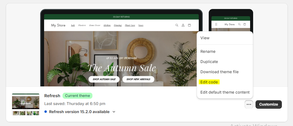
Step 1: Duplicate Your Theme
Before making any changes, it’s always a good idea to duplicate your current theme. This ensures you have a backup in case anything goes wrong.
- Go to Online Store > Themes.
- Find your active theme and click on the Actions dropdown.
-
Select Duplicate


Step 2: Update in Existing Section File
Next, we’ll update in the existing section for the text overlays to collection images.
- In the Shopify admin, go to Online Store > Themes.
-
Click Actions > Edit code for your active theme.
- Search for the file card-collection.liquid in snippets folder and open it.
- Replace the whole file code with the below code and save the file.

    {% comment %}
  Renders a collection card

  Accepts:
  - card_collection: {Object} Collection Liquid object
  - media_aspect_ratio: {String} Size of the product image card. Values are "square" and "portrait". Default is "square" (optional)
  - columns: {Number}
  - extend_height: {Boolean} Card height extends to available container space. Default: false (optional)
  - wrapper_class: {String} Wrapper class for card (optional)
  - placeholder_image: {String} Placeholder image when collection is empty (optional)

  Usage:
  {% render 'card-collection' %}
{% endcomment %}

{%- liquid
  assign ratio = 1
  if card_collection.featured_image and media_aspect_ratio == 'portrait'
    assign ratio = 0.8
  elsif card_collection.featured_image and media_aspect_ratio == 'adapt'
    assign ratio = card_collection.featured_image.aspect_ratio
  endif
  if ratio == 0 or ratio == null
    assign ratio = 1
  endif
  assign card_color_scheme = settings.card_color_scheme
  assign card_style = settings.card_style
  if wrapper_class == null or wrapper_class == 'none'
    assign card_color_scheme = settings.collection_card_color_scheme
    assign card_style = settings.collection_card_style
  endif

   assign card_border_color = border_color
   if enable_border == false
     assign card_border_color = '#ffffff00'
   endif
-%}

{% style %}
.collection-list__item .card {
    position: relative;
}
.collection-list__item .card__content {
    position: absolute;
    height: 100%;
    width: 100%;
}
.collection-list__item .card__information {
    justify-content: center;
    align-items: center;
    display: flex;
}

.collection-list__item .card__heading {
    margin-top: 0;
    margin-bottom: 0;
    background-color:  {{label_color}};
    padding: 10px;
    border: solid 1px;
  border-color: {{card_border_color}};
    outline: 4px solid;
  outline-color: {{label_color}};
}

  @media screen and (max-width: 749px) {
    .collection-list__item .card__heading {
      font-size: small;
    }
  }

  {% endstyle %}


<div class="card-wrapper animate-arrow {% if wrapper_class and wrapper_class != 'none' %}{{ wrapper_class }}{% else %}collection-card-wrapper{% endif %}">
  <div
    class="
      card
      card--{{ card_style }}
      {% if card_collection.featured_image %} card--media{% else %} card--text{% endif %}
      {% if card_style == 'card' %} color-{{ card_color_scheme }} gradient{% endif %}
      {% if extend_height %} card--extend-height{% endif %}
      {% if card_collection.featured_image == nil and card_style == 'card' %} ratio{% endif %}
    "
    style="--ratio-percent: {{ 1 | divided_by: ratio | times: 100 }}%;"
  >
    <div
      class="card__inner {% if card_style == 'standard' %}color-{{ card_color_scheme }} gradient{% endif %}{% if card_collection.featured_image or card_style == 'standard' %} ratio{% endif %}"
      style="--ratio-percent: {{ 1 | divided_by: ratio | times: 100 }}%;"
    >
      {%- if card_collection.featured_image -%}
        <div class="card__media">
          <div class="media media--transparent media--hover-effect">
            <img
              srcset="
                {%- if card_collection.featured_image.width >= 165 -%}{{ card_collection.featured_image | image_url: width: 165 }} 165w,{%- endif -%}
                {%- if card_collection.featured_image.width >= 330 -%}{{ card_collection.featured_image | image_url: width: 330 }} 330w,{%- endif -%}
                {%- if card_collection.featured_image.width >= 535 -%}{{ card_collection.featured_image | image_url: width: 535 }} 535w,{%- endif -%}
                {%- if card_collection.featured_image.width >= 750 -%}{{ card_collection.featured_image | image_url: width: 750 }} 750w,{%- endif -%}
                {%- if card_collection.featured_image.width >= 1000 -%}{{ card_collection.featured_image | image_url: width: 1000 }} 1000w,{%- endif -%}
                {%- if card_collection.featured_image.width >= 1500 -%}{{ card_collection.featured_image | image_url: width: 1500 }} 1500w,{%- endif -%}
                {%- if card_collection.featured_image.width >= 3000 -%}{{ card_collection.featured_image | image_url: width: 3000 }} 3000w,{%- endif -%}
                {{ card_collection.featured_image | image_url }} {{ card_collection.featured_image.width }}w
              "
              src="{{ card_collection.featured_image | image_url: width: 1500 }}"
              sizes="
                (min-width: {{ settings.page_width }}px) {{ settings.page_width | minus: 100 | divided_by: columns }}px,
                (min-width: 750px) {% if columns > 1 %}calc((100vw - 10rem) / 2){% else %}calc(100vw - 10rem){% endif %},
                calc(100vw - 3rem)
              "
              alt="{{ card_collection.featured_image.alt | escape }}"
              height="{{ card_collection.featured_image.height }}"
              width="{{ card_collection.featured_image.width }}"
              loading="lazy"
              class="motion-reduce"
            >
          </div>
        </div>
      {%- endif -%}
      {%- if card_collection == blank -%}
        <div class="card__media">
          {{ placeholder_image | placeholder_svg_tag: 'placeholder-svg' }}
        </div>
      {%- else -%}
        <div class="card__content">
          <div class="card__information">
            <h3 class="card__heading">
              <a
                {% if card_collection == blank %}
                  role="link" aria-disabled="true"
                {% else %}
                  href="{{ card_collection.url }}"
                {% endif %}
                class="button button--primary"
              >
                {%- if card_collection.title != blank -%}
                  {{- card_collection.title | escape -}}
                {%- else -%}
                  {{ 'onboarding.collection_title' | t }}
                {%- endif -%}
                {%- if card_collection.description == blank -%}
                  <span class="icon-wrap">
                    {{- 'icon-arrow.svg' | inline_asset_content -}}
                  </span>
                {%- endif %}
              </a>
            </h3>
            {%- if card_collection.description != blank -%}
              <p class="card__caption">
                {{- card_collection.description | strip_html | truncatewords: 12 -}}
                <span class="icon-wrap">
                  {{- 'icon-arrow.svg' | inline_asset_content -}}
                </span>
              </p>
            {%- endif -%}
          </div>
        </div>
      {%- endif -%}
    </div>
    {%- if card_collection != blank and card_style == 'card' or card_collection.featured_image -%}
      <div class="card__content">
        <div class="card__information">
          <h3 class="card__heading">
            <a
              {% if card_collection == blank %}
                role="link" aria-disabled="true"
              {% else %}
                href="{{ card_collection.url }}"
              {% endif %}
              class="full-unstyled-link"
            >
              {%- if card_collection.title != blank -%}
                {{- card_collection.title | escape -}}
              {%- else -%}
                {{ 'onboarding.collection_title' | t }}
              {%- endif -%}
              {% comment %}
              {%- if card_collection.featured_image or card_collection.description == blank -%}
                <span class="icon-wrap">
                  {{- 'icon-arrow.svg' | inline_asset_content -}}
                </span>
              {%- endif %}
      {% endcomment %}
            </a>
          </h3>
          {%- if card_collection.featured_image == null and card_collection.description != blank -%}
            <p class="card__caption">
              {{- card_collection.description | strip_html | truncatewords: 12 -}}
              <span class="icon-wrap">
                {{- 'icon-arrow.svg' | inline_asset_content -}}
              </span>
            </p>
          {%- endif -%}
        </div>
      </div>
    {%- endif -%}
    {%- if card_collection == blank -%}
      <div class="card__content">
        <div class="card__information">
          <h3 class="card__heading card__heading--placeholder">
            <a role="link" aria-disabled="true" class="full-unstyled-link">
              {{ 'onboarding.collection_title' | t }}
            </a>
          </h3>
        </div>
      </div>
    {%- endif -%}
  </div>
</div>
- Search for the file collection-list.liquid in sections folder and open it.
- Replace the whole file code with the below code and save the file.
    {{ 'section-collection-list.css' | asset_url | stylesheet_tag }}
{{ 'component-card.css' | asset_url | stylesheet_tag }}
{{ 'component-slider.css' | asset_url | stylesheet_tag }}

{%- style -%}
  .section-{{ section.id }}-padding {
    padding-top: {{ section.settings.padding_top | times: 0.75 | round: 0 }}px;
    padding-bottom: {{ section.settings.padding_bottom | times: 0.75 | round: 0 }}px;
  }

  @media screen and (min-width: 750px) {
    .section-{{ section.id }}-padding {
      padding-top: {{ section.settings.padding_top }}px;
      padding-bottom: {{ section.settings.padding_bottom }}px;
    }
  }
{%- endstyle -%}

{%- liquid
  assign columns_mobile_int = section.settings.columns_mobile | plus: 0
  assign show_mobile_slider = false
  if section.settings.swipe_on_mobile and section.blocks.size > columns_mobile_int
    assign show_mobile_slider = true
  endif
-%}

<div class="color-{{ section.settings.color_scheme }} gradient">
  <div class="collection-list-wrapper page-width isolate{% if show_mobile_slider %} page-width-desktop{% endif %}{% if section.settings.title == blank %} no-heading{% endif %}{% if section.settings.show_view_all == false or section.blocks.size > collections.size %} no-mobile-link{% endif %} section-{{ section.id }}-padding">
    {%- unless section.settings.title == blank -%}
      <div class="title-wrapper-with-link{% if show_mobile_slider %} title-wrapper--self-padded-tablet-down{% else %} title-wrapper--self-padded-mobile{% endif %} title-wrapper--no-top-margin">
        <h2
          id="SectionHeading-{{ section.id }}"
          class="collection-list-title inline-richtext {{ section.settings.heading_size }}{% if settings.animations_reveal_on_scroll %} scroll-trigger animate--slide-in{% endif %}"
        >
          {{ section.settings.title }}
        </h2>

        {%- if section.settings.show_view_all and show_mobile_slider -%}
          <a
            href="{{ routes.collections_url }}"
            id="ViewAll-{{ section.id }}"
            class="link underlined-link large-up-hide{% if settings.animations_reveal_on_scroll %} scroll-trigger animate--slide-in{% endif %}"
            aria-labelledby="ViewAll-{{ section.id }} SectionHeading-{{ section.id }}"
          >
            {{- 'sections.collection_list.view_all' | t -}}
          </a>
        {%- endif -%}
      </div>
    {%- endunless -%}

    <slider-component class="slider-mobile-gutter{% if settings.animations_reveal_on_scroll %} scroll-trigger animate--slide-in{% endif %}">
      <ul
        class="collection-list contains-card contains-card--collection{% if settings.card_style == 'standard' %} contains-card--standard{% endif %} grid grid--{{ section.settings.columns_desktop }}-col-desktop grid--{{ section.settings.columns_mobile }}-col-tablet-down{% if section.settings.swipe_on_mobile %} slider slider--tablet grid--peek{% endif %} collection-list--{{ section.blocks.size }}-items"
        id="Slider-{{ section.id }}"
        role="list"
      >
        {%- liquid
          assign columns = section.blocks.size
          if columns > 3
            assign columns = 3
          endif
        -%}
        {%- for block in section.blocks -%}
          <li
            id="Slide-{{ section.id }}-{{ forloop.index }}"
            class="collection-list__item grid__item{% if show_mobile_slider %} slider__slide{% endif %}{% if block.settings.collection.featured_image == nil %} collection-list__item--no-media{% endif %}{% if settings.animations_reveal_on_scroll %} scroll-trigger animate--slide-in{% endif %}"
            {{ block.shopify_attributes }}
            {% if settings.animations_reveal_on_scroll %}
              data-cascade
              style="--animation-order: {{ forloop.index }};"
            {% endif %}
          >
            {%- assign placeholder_image_index = forloop.index0 | modulo: 4 | plus: 1 -%}
            {%- assign placeholder_image = 'collection-apparel-' | append: placeholder_image_index -%}
            {% render 'card-collection',
              card_collection: block.settings.collection,
              label_color: section.settings.label_color,
              border_color: section.settings.border_color,
              enable_border: section.settings.border_checkbox,
              media_aspect_ratio: section.settings.image_ratio,
              columns: columns,
              placeholder_image: placeholder_image
            %}
          </li>
        {%- endfor -%}
      </ul>
      {%- if show_mobile_slider -%}
        <div class="slider-buttons">
          <button
            type="button"
            class="slider-button slider-button--prev"
            name="previous"
            aria-label="{{ 'general.slider.previous_slide' | t }}"
          >
            <span class="svg-wrapper">
              {{- 'icon-caret.svg' | inline_asset_content -}}
            </span>
          </button>
          <div class="slider-counter caption">
            <span class="slider-counter--current">1</span>
            <span aria-hidden="true"> / </span>
            <span class="visually-hidden">{{ 'general.slider.of' | t }}</span>
            <span class="slider-counter--total">{{ section.blocks.size }}</span>
          </div>
          <button
            type="button"
            class="slider-button slider-button--next"
            name="next"
            aria-label="{{ 'general.slider.next_slide' | t }}"
          >
            <span class="svg-wrapper">
              {{- 'icon-caret.svg' | inline_asset_content -}}
            </span>
          </button>
        </div>
      {%- endif -%}
    </slider-component>

    {%- if section.settings.show_view_all and section.blocks.size < collections.size -%}
      <div
        class="center collection-list-view-all{% if show_mobile_slider %} small-hide medium-hide{% endif %}{% if settings.animations_reveal_on_scroll %} scroll-trigger animate--slide-in{% endif %}"
        {% if settings.animations_reveal_on_scroll %}
          data-cascade
        {% endif %}
      >
        <a
          href="{{ routes.collections_url }}"
          class="button"
          id="ViewAllButton-{{ section.id }}"
          aria-labelledby="ViewAllButton-{{ section.id }} SectionHeading-{{ section.id }}"
        >
          {{- 'sections.collection_list.view_all' | t -}}
        </a>
      </div>
    {%- endif -%}
  </div>
</div>

{% schema %}
{
  "name": "t:sections.collection-list.name",
  "tag": "section",
  "class": "section section-collection-list",
  "max_blocks": 15,
  "disabled_on": {
    "groups": ["header", "footer"]
  },
  "settings": [
    {
      "type": "inline_richtext",
      "id": "title",
      "default": "t:sections.collection-list.settings.title.default",
      "label": "t:sections.collection-list.settings.title.label"
    },
    {
      "type": "select",
      "id": "heading_size",
      "options": [
        {
          "value": "h2",
          "label": "t:sections.all.heading_size.options__1.label"
        },
        {
          "value": "h1",
          "label": "t:sections.all.heading_size.options__2.label"
        },
        {
          "value": "h0",
          "label": "t:sections.all.heading_size.options__3.label"
        },
        {
          "value": "hxl",
          "label": "t:sections.all.heading_size.options__4.label"
        },
        {
          "value": "hxxl",
          "label": "t:sections.all.heading_size.options__5.label"
        }
      ],
      "default": "h1",
      "label": "t:sections.all.heading_size.label"
    },
    {
      "type": "select",
      "id": "image_ratio",
      "options": [
        {
          "value": "adapt",
          "label": "t:sections.collection-list.settings.image_ratio.options__1.label"
        },
        {
          "value": "portrait",
          "label": "t:sections.collection-list.settings.image_ratio.options__2.label"
        },
        {
          "value": "square",
          "label": "t:sections.collection-list.settings.image_ratio.options__3.label"
        }
      ],
      "default": "square",
      "label": "t:sections.collection-list.settings.image_ratio.label",
      "info": "t:sections.collection-list.settings.image_ratio.info"
    },
    {
      "type": "range",
      "id": "columns_desktop",
      "min": 1,
      "max": 6,
      "step": 1,
      "default": 3,
      "label": "t:sections.collection-list.settings.columns_desktop.label"
    },
    {
      "type": "color_scheme",
      "id": "color_scheme",
      "label": "t:sections.all.colors.label",
      "info": "t:sections.all.colors.has_cards_info",
      "default": "scheme-1"
    },
    {
      "type": "checkbox",
      "id": "show_view_all",
      "default": false,
      "label": "t:sections.collection-list.settings.show_view_all.label"
    },
    {
      "type": "header",
      "content": "t:sections.collection-list.settings.header_mobile.content"
    },
    {
      "type": "select",
      "id": "columns_mobile",
      "options": [
        {
          "value": "1",
          "label": "t:sections.collection-list.settings.columns_mobile.options__1.label"
        },
        {
          "value": "2",
          "label": "t:sections.collection-list.settings.columns_mobile.options__2.label"
        }
      ],
      "default": "1",
      "label": "t:sections.collection-list.settings.columns_mobile.label"
    },
    {
      "type": "checkbox",
      "id": "swipe_on_mobile",
      "default": false,
      "label": "t:sections.collection-list.settings.swipe_on_mobile.label"
    },
    {
      "type": "header",
      "content": "Text Label Color Settings"
    },
     {
      "type": "checkbox",
      "id": "border_checkbox",
      "default": false,
      "label": "Enable Border"
    },
    {
      "type": "color",
      "id": "label_color",
      "label": "Label Color",
      "default": "#FFFFFF"
    },
         {
      "type": "color",
      "id": "border_color",
      "label": "Border Color",
      "default": "#000000"
    },
    {
      "type": "header",
      "content": "t:sections.all.padding.section_padding_heading"
    },

    {
      "type": "range",
      "id": "padding_top",
      "min": 0,
      "max": 100,
      "step": 4,
      "unit": "px",
      "label": "t:sections.all.padding.padding_top",
      "default": 36
    },
    {
      "type": "range",
      "id": "padding_bottom",
      "min": 0,
      "max": 100,
      "step": 4,
      "unit": "px",
      "label": "t:sections.all.padding.padding_bottom",
      "default": 36
    }
  ],
  "blocks": [
    {
      "type": "featured_collection",
      "name": "t:sections.collection-list.blocks.featured_collection.name",
      "settings": [
        {
          "type": "collection",
          "id": "collection",
          "label": "t:sections.collection-list.blocks.featured_collection.settings.collection.label"
        }
      ]
    }
  ],
  "presets": [
    {
      "name": "t:sections.collection-list.presets.name",
      "blocks": [
        {
          "type": "featured_collection"
        },
        {
          "type": "featured_collection"
        },
        {
          "type": "featured_collection"
        }
      ]
    }
  ]
}
{% endschema %}
Step 3: Test and Refine
After implementing the text overlay, preview your page on different devices and browsers. Make sure the text remains readable, the images are not distorted, and the user experience is smooth. Test the page's performance, as large images or overly complex CSS can slow down load times. Keep your images optimized and your code minimal to ensure fast loading speeds.
Why Text Overlays Are a Game Changer for Your Store
You might wonder, is all this effort really worth it? The answer is a resounding yes! Text overlays serve multiple purposes:
- Enhances Visual Appeal: With text overlays, your store looks more professional and engaging.
- Increases Conversions: A well-placed call-to-action or promotion text over a stunning image can significantly boost your conversion rates.
- Improves User Experience: By providing context directly on the image, you reduce the cognitive load for users, making it easier for them to navigate your store.
In the words of design expert Paul Rand, "Design is the silent ambassador of your brand." A polished image with a compelling text overlay communicates your brand message effortlessly.
Conclusion: Bringing It All Together
Adding a text overlay to your collection images is not just about aesthetics—it’s about creating a seamless user experience that drives engagement and conversions. By following the steps outlined here, you can create an eye-catching, responsive page that highlights your collections in a professional way. Whether you're showcasing seasonal sales, new arrivals, or specific product categories, text overlays can elevate your store's visual storytelling.
So, what are you waiting for? It’s time to give your Shopify store the visual boost it deserves. Will you take the leap and start adding text overlays to your collection images? The results might just surprise you!


Looking for something specific? Drop me a message.